
What is the ATR indicator?
It was developed by J. Welles Wilder and was first mentioned in his book, New Concepts in Technical Analysis Systems (in 1978).
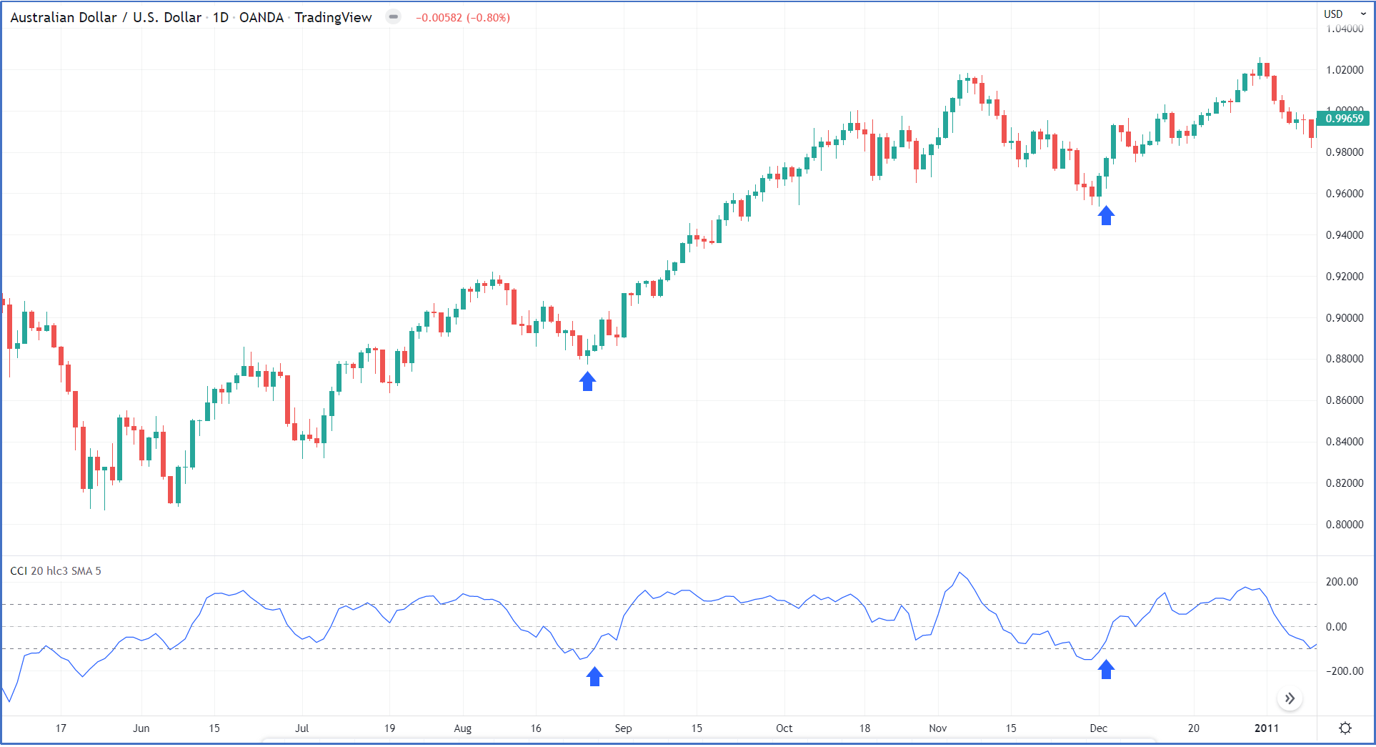
The true average range (ATR) indicator is a volatility indicator that measures how much the price of an asset has been moving over some time, and how volatile the asset has been. An expanding ATR indicates increased volatility in the market, with the range of each bar getting larger. A low ATR value indicates a series of periods with small ranges (quiet days). As shown in figure (1)

Figure 1
Please click For bigger size
How ATR is Calculated?
ATR = (Previous ATR * (n - 1) + TR) / n
Where:
ATR = Average True Range
n = number of periods or bars
TR = True Range

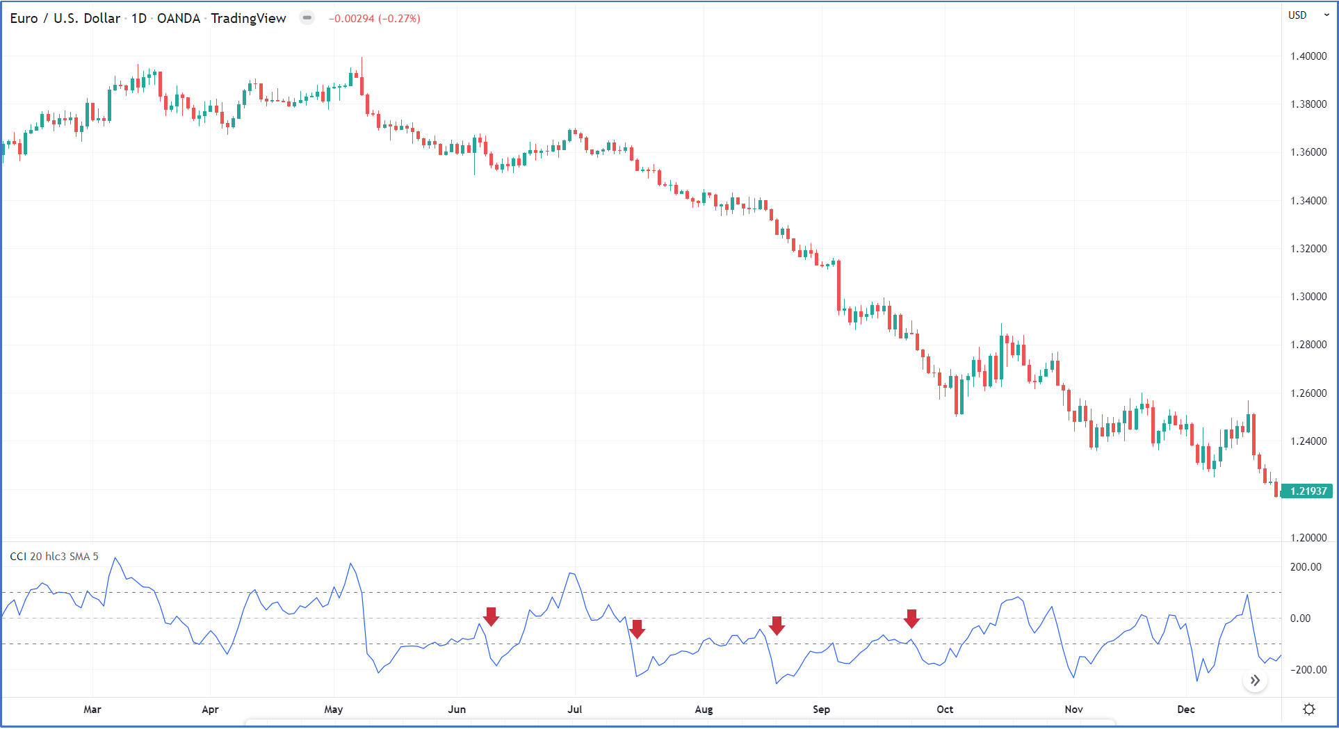
Figure 2
Please click For bigger size
The True Range for today is the greatest of the following:
- Today's high minus today's low.
- The absolute value of today's high minus yesterday's close.
- The absolute value of today's low minus yesterday's close. as shown in figure (2)
How to use ATR indicator?
ATR is very useful for determining take profit and stop loss. If you are a day trader, you should place your take profit around the ATR value and place your stop loss higher than the ATR value. ATR is based on the True Range, which uses absolute price changes, so ATR reflects volatility as an absolute level. In other words, ATR is not shown as a percentage of the current close.
How to use ATR as a Day trader?
If your strategy triggers an entry signal but the today range exceeds the current ATR, this signal should be ignored. And whenever the price closes more than one ATR, it is a good time to take some profit.
ATR as trailing stop.
ATR could be used as trailing stop by k * ATR (14) as k can be 2 or 3 based on the trader risk management plan. Closing a long position becomes a safe bet whenever the price closes more than one ATR because the stock is likely to enter a trading range or reverse direction at this point.
Chandelier Exit indicator
Chandelier Exit (CE) is a volatility-based indicator identifying stop-loss exit points for long and short trading positions. It is based on the Average True Range (ATR) indicator. During lower volatility trading sessions, traders set small trailing stop losses. The possibility of a trend reversal is low during low volatility trading sessions. However, in higher volatility trading, traders set a larger trailing loss in order to protect themselves from choppy trading. Traders use Chandelier Exit as a trailing stop-loss and as a way of protecting themselves from losses resulting from trend reversals.
The formulas for the two lines are as follows:
Chandelier Exit Long: n-day Highest High – ATR (n) x Multiplier
Chandelier Exit Short: n-day Lowest Low + ATR (n) x Multiplier
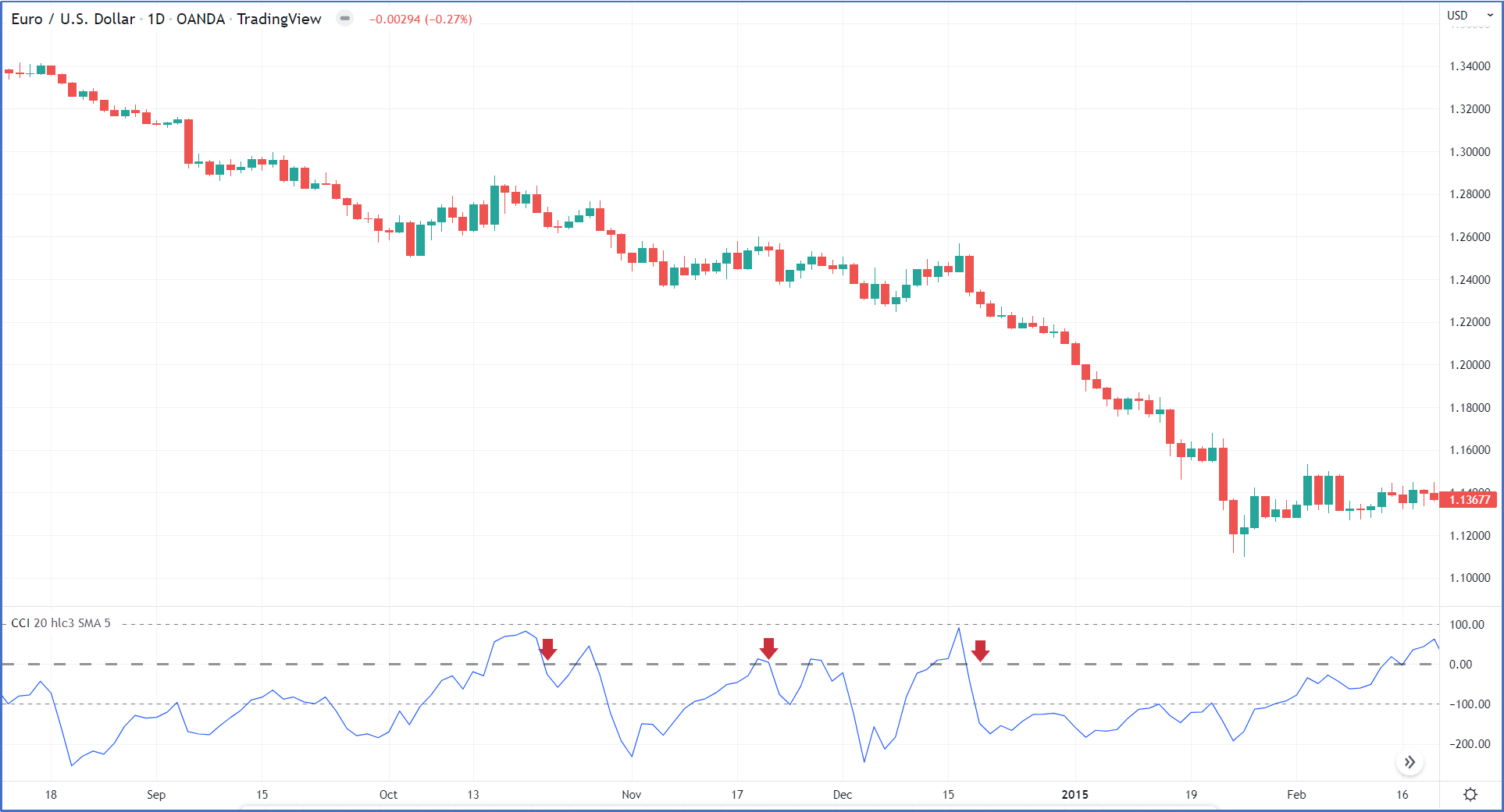
Charles Le Beau recommended setting an input period of 22 and a multiple of 3 times the Average True Range, as shown in figure (3)

Figure 3
Please click For bigger size
Long Positions
During long positions, Chandelier Exit indicator will move below prices, but sometimes, during low volatility, sideways could lead to some false exits, as shown in figure (4).

Figure 4
Please click For bigger size
Short Positions
During short positions, Chandelier Exit indicator will move above prices, but sometimes, during low volatility, sideways could lead to some false exits, as shown in figure (5).

Figure 5
Please click For bigger size
Limitations of the Average True Range (ATR).
- ATR is a subjective measure; there is no single ATR value that will tell you with any certainty that a trend is about to reverse or not. Instead, ATR readings should always be compared against earlier readings to get a feel of a trend's strength or weakness.
- ATR only measures volatility and not the direction of an asset's price.
The content published above has been prepared by CFI for informational purposes only and should not be considered investment advice. Any view expressed does not constitute a personal recommendation or solicitation to buy or sell. The information provided does not have regard to the specific investment objectives, financial situation, and needs of any specific person who may receive it, and is not held out as independent investment research and may have been acted upon by persons connected with CFI. Market data is derived from independent sources believed to be reliable, however, CFI makes no guarantee of its accuracy or completeness, and accepts no responsibility for any consequence of its use by recipients.


 income statement for the Quarter June 1st, 2022")